


Chartbook #40 Newsflash: German election beyond the headlines.
Who voted for whom in 2021?

The 2021 election confirms the result of 2017. Since unification and under the impact of dramatic socio-economic stresses of recent decades, Germany has become a six-party system. This is most dramatically true in the former GDR.
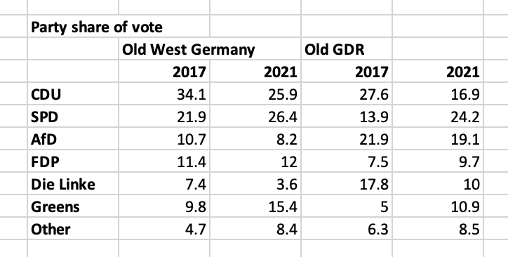
NB: “other” are various minor parties and local electoral initiatives that generally fail to break the 5% threshold and are not represented in the Bundestag.
NB: CDU numbers also refer to Bavarian CSU, both are sometimes abbreviated as “Union”.
The right-wing AfD that first entered the Bundestag in 2017 has sustained its vote share in both East and West. The collapse of the CDU in the East makes it the third party in the East behind the AfD. The SPD did much better than in 2017, making particularly gigantic gains in the East.
The SPD’s gains have divided the former Communist states between North and South. The AfD is solidly entrenched in Central Germany in Saxony and Thuringia , whereas the SPD has come back strongly in Brandenburg and Mecklenburg-Vorpommern in the North.

Die Linke - formed out of the ex-Communists and the West German left in reaction to the neoliberal policies of early 2000s - appears to have fallen short of the 5 percent hurdle, but will be represented in Bundestag with its 4.9% of the vote, on the basis of 3 direct mandates it won (this gets complicated). The key is, that Die Linke has enough support in the former GDR to keep a toehold at the national level.
A system as divided as this is complicated and multiply-constrained. The AfD is ruled out as a coalition partner. Die Linke is demonized by the CDU/FDP and uncomfortable for the SPD. We will have weeks of coalition discussions to come. After 2017 it took half a year to form a new government.
But complexity should not be seen as a sign of dysfunction. It reflects real divisions in German social, cultural and political attitudes.
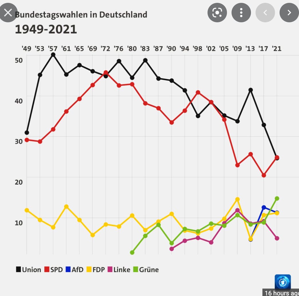
The first round of the French presidential election divides the political field in a similar way. The Dutch political system is fissured into many camps. If the US political system permitted it, one can easily imagine US politics being divided in a somewhat similar fashion from the nationalist right to the Bernie/AOC left-wing.
The big news of the German election is the collapse in support for the CDU. As a result, the SPD has emerged as the victor. The chutzpah of Laschet in insisting that he wants to form a government and the celebrations on the part of the SPD cannot disguise the fact that both the two leading parties of the Federal Republic have been reduced to levels of support, which would once have been thought humiliating. They are no longer Volksparteien - people’s parties - but simply somewhat larger players in a majority minority system.
In 2019, the SPD seemed to be en route to the kind of terminal collapse suffered by PASOK in Greece, or the the shrinking French socialist party. Instead, they have stabilized in the mid 20s.
Early estimates allow us to pinpoint not just the overall level of votes, but the direction of voter movements between the parties. In a six-party system, these movements can be complicated.
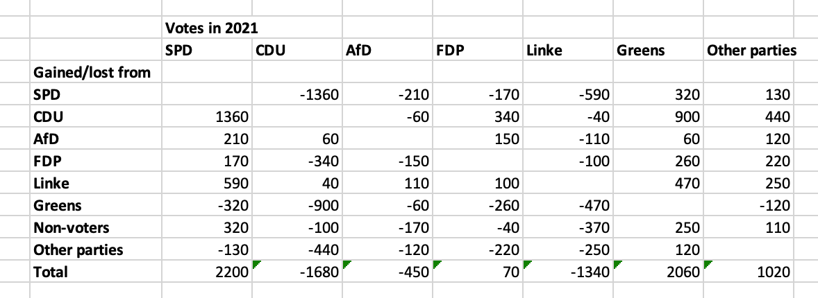
Source: Tagesschau
Preliminary estimates suggest that the CDU and die Linke lost voters heavily to both the SPD and the Greens. The scale of the migration from the CDU to the Greens is particularly striking when compared to what one might think of as a more normal movement from the CDU to the FDP. The Greens also gained from the SPD and they were the only party to make substantial inroads amongst non-voters and “other” smaller parties. The FDP saw traffic both ways, with voters switching to them from the CDU and the AfD, whilst at the same time hundreds of thousands switched from the FDP to the Greens and the SPD.
***********
To subscribe to Chartbook there are three options.
The annual subscription: $50 annually
The standard monthly subscription: $5 monthly - which gives you a bit more flexibility.
Founders club:$ 120 annually, or another amount at your discretion - for those who really love Chartbook Newsletter, or read it in a professional setting in which you regularly pay for subscriptions, please consider signing up for the Founders Club.
Those who cannot afford a regular subscription can also pick the free option.
************
Results can also be deceiving when it comes to interpreting the general mood of the electorate and its dynamics.
This was a “change” election. The share of German voters wanting change surged. This impulse was particularly strong in the four smaller parties. The CDU/CSU was most conservative.
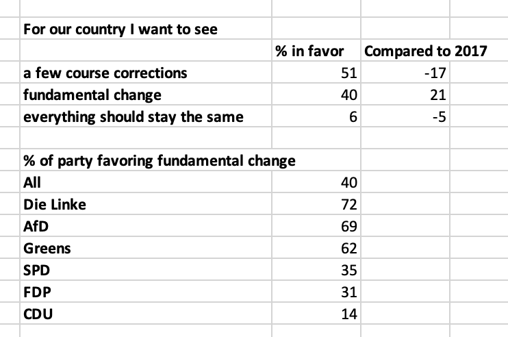
Source: Tagesschau
Only 19 percent of Germans think the prosperity of their country is distributed fairly, versus 77 percent who do not. Dissatisfaction with the income and wealth distribution is shared by both left and the AfD on the far-right who express resentment of those in East Germany and hostility towards foreigners.
Nevertheless, votes for both Die Linke and AfD declined. Voters clustered in the middle.
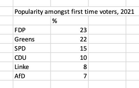
And where the SPD really outscored the CDU was not amongst young Germans, eager for dramatic change. First-time voters flocked to the Greens and the FDP.
Source: Tagesschau
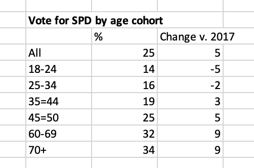
The SPD’s share of the younger voter was not only low, but fell sharply relative to 2017. The SPD’s “victory” came entirely from increased votes from those in their late 30s and above.
Source: Tagesschau
The SPD’s modest victory seems to have been the result of anxious older voters choosing Scholz, presumably because he most clearly represented continuity with the Merkel era.
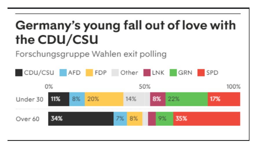
The preferences of younger and older voters in Germany are very different. The young favor the FDP and the AfD, on the right, and die Die Linke and the Greens, on the left.
Source: New Statesman
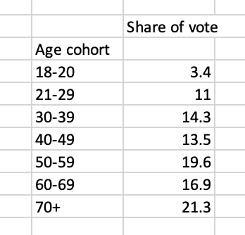
It is the elderly who still cling to the traditional parties of West Germany. And elderly voters dominate the German electorate. Voters over 60 make up almost 40 percent of the electorate.
Source: Tagesschau
Women voters switched hard from the CDU. Female support for the CDU crashed from 36 to 24 percent. Meanwhile, male support for the far-right AfD continues to run at much higher levels. If only women’s votes counted, a Red-Red-Green coalition would have had a majority in 2021.
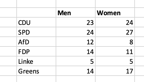
Source: Tagesschau
What next?
On election night Laschet of the CDU managed to suggest that he still had a mandate to form a government. The FDP would prefer to form a coalition with the CDU. But in light of this disaster why would the Greens agree?
As a sign of the times, the coalition negotiations have started not with the CDU or the SPD but between the Greens and the FDP. If they can agree on the terms with which they will form a coalition with the SPD that seals the deal.
The implications for climate policy, German economic policy and Europe are highly significant, as I discussed in Chartbook 38.
After this result the FDP will cling hard to the idea that Lindner should be finance minister. Right now the most optimistic scenario is perhaps one in which Lindner is given that job, but he is outflanked by a new environmental super ministry perhaps headed by Habeck, which has the task to do large scale climate investment off the federal balance sheet. A lot will depend on the degree to which the Greens and the SPD can define policy for the coalition. Watch this space.
Perhaps a naive take, but the multiparty approach seems to deliver policies more in line with the average voter.
Very interesting and quite informative. I am wondering about the color coding for the map at the head of the newsletter, particularly about the multiple gray-toned election districts that seem to relate to the color coding at the bottom of the newsletter; but the result is ambiguous. What significance, if any, should readers attribute to the color distributions among what appear to be 299 vote count reporting districts?